
Attention
Wat trekt de aandacht en bepaalt de interpretatie? Aandacht is nooit neutraal. Wat je benadrukt, bepaalt wat mensen opmerken en wat ze negeren.
Een leuke en gedurfde keynote over vertrouwen, perceptie en besluitvorming in het tijdperk van AI.

Data is overal. Toch worden beslissingen nog steeds uitgesteld en primeert het buikgevoel.
67% van de mensen vertrouwt zijn data niet bij het nemen van beslissingen.
De kans is groot dat jij je ook zo voelt.
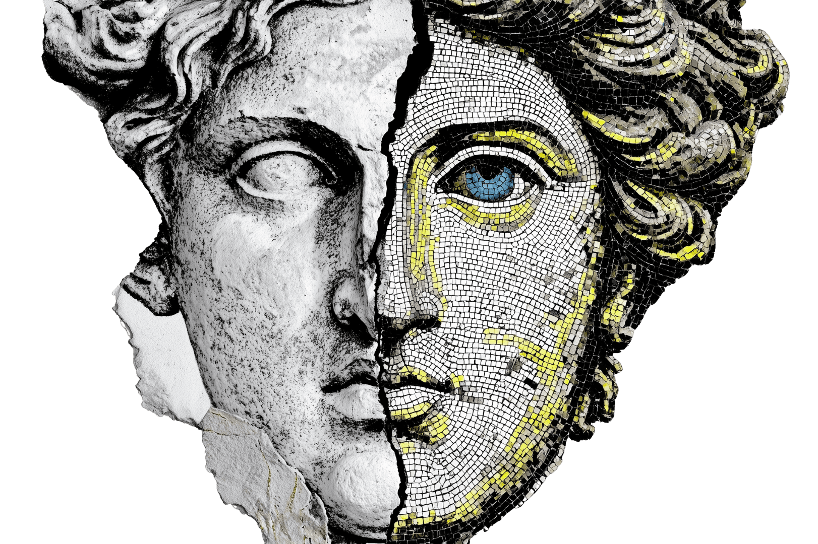
Het probleem zit niet in de data.
Het probleem is hoe je ernaar kijkt.
Kunstenaars trainen hun oog om patronen en betekenis te vinden. Diezelfde denkwijze is cruciaal voor datacommunicatie.
Sindsdien bouw ik elk dataverhaal rond één vraag: wat ziet iemand echt?
Om perceptie in actie om te zetten, hebben mensen structuur nodig. Een manier om te begrijpen hoe data wordt opgemerkt, geïnterpreteerd en gebruikt. Die structuur heet A.R.T.
Wat trekt de aandacht en bepaalt de interpretatie? Aandacht is nooit neutraal. Wat je benadrukt, bepaalt wat mensen opmerken en wat ze negeren.
Hoe mensen patronen herkennen, betekenis interpreteren en bepalen of data betrouwbaar aanvoelt. Dit is waar vertrouwen wordt opgebouwd. Of juist niet.
Wat mensen onthouden en doen nadat het verhaal achter de data is doorgedrongen. Geen concrete conclusie betekent geen beslissing, hoe goed je data ook is.
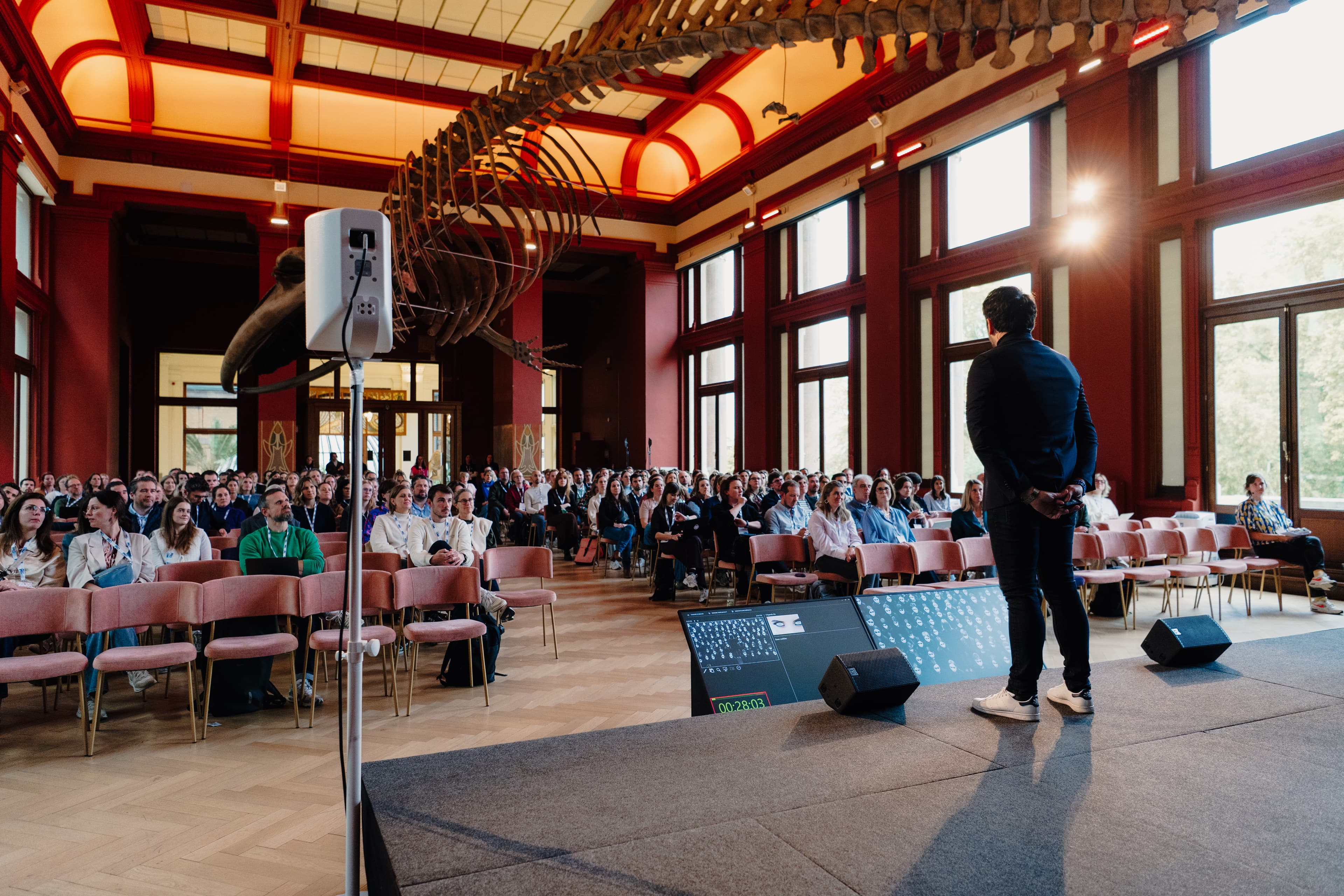
Henny is een dynamische, extraverte spreker die bekend staat om zijn boeiende verhalen, energieke presentatie en zijn publiek aanzet tot nadenken. Waar anderen het onderwerp data misschien saai of droog vinden, maakt Henny het luchtig, leuk en actiegedreven. Met zijn passie om complexe ideeën begrijpelijk te maken, daagt hij conventionele denkwijzen uit en inspireert hij je om opnieuw na te denken over de manier waarop je data en AI in je dagelijkse werk gebruikt.
Henny grijpt het publiek bij de keel met zijn A.R.T.-model en maakt ons allemaal bewust van hoe belangrijk data zal worden.
Dit was met afstand de beste sessie van de dag. Leiders moeten zich bewust worden van de kracht van datavisualisaties.

“Tijdens het evenement heb ik verschillende inspirerende sessies over datavisualisatie bijgewoond, waarvan vooral de sessie How A.R.T. can help you communicate data van Henny Speelman indruk maakte. Interessant, leerzaam en vooral erg leuk!”
“Dit is een van de beste pitches die ik ooit gezien heb. De snelheid, de kwaliteit en de inzichten zaten allemaal op punt.”
“Ik wist niet wat te verwachten, maar ik vond het heel interessant om de combinatie tussen datavisualisatie en storytelling te zien. Hier heb ik dingen geleerd die ik nu al kan toepassen.”

“Henny is echt gepassioneerd over dit onderwerp. Zijn A.R.T.-model was een echte eye-opener.”
“Henny is een echte verhalenverteller. Als je de kans krijgt om hem te zien schitteren, wacht dan niet te lang voor hij duur wordt. ;-)”

“Henny's pragmatische, aantrekkelijke en humoristische manier om mensen rond data te inspireren is welkom en verfrissend!”

“Dit is waar data om draait. En de slides… die komen van een andere planeet.”
“Normaal gezien geef ik niet om datavisualisaties, maar Henny heeft mijn interesse weten te wekken.”
Deze keynote is zo ontworpen dat hij naadloos aansluit op verschillende evenementvormen en doelgroepen.


Je hoeft geen data-analist te zijn om succesvol te zijn met data. Je moet alleen weten hoe je het op de juiste manier gebruikt.

